Wednesday, August 26, 2009

Looking for additional direct mail suggestions? Achieve a 20% Response Rate!

In any direct mail campaign, it is important to have a decent list of people to send your mailer out to, but 98% of the time, these prospective clients won’t even respond. Unfortunately, a surprising 44% of recipients won’t even open your letter – it will go straight into the trashcan. So, the question remains – what is the secret to getting your direct mail not only opened and responded to but also to provide quality sales leads?

In my many years of owning my own marketing firm, I have seen both good and bad direct mail campaigns, but there is one perfect recipe I have found that can provide a response rate of 10-20% or even higher. One of my clients, a cabinetry remodeling business that earns $40,000 - $60,000 per ticket, was even forced to stop mid-campaign because they were receiving more leads than they could handle.

So, here’s the answer to your direct mail problems:

1) First and foremost, provide an incentive. People will be much more likely to give you their information if they are going to get something in return. The most important aspect of achieving such a high response rate is that you offer the recipient a free $5 gift card for lunch, gas, coffee, or something else that almost everyone partakes in. A $5 gift card might not seem like that much, but it is a free lunch for the recipient and all they have to do is provide you with a little bit of personal information.

For you, the cost of the $5 gift cards may add up, but think about the sales you will get from all of the personal information you receive. Now, you have hot leads on everyone who gave you their information and you also have quality addresses for future mailings. If you send 100 direct mail, get 20 responses (only $100 in gift cards), and you make 10 sales with even as low as a $5000 ticket, you’ve earned $49900. Obviously, it’s worth it.

2) Collect useful information. By offering a free lunch or free gas, you’re going to get a lot of responses from people that simply have no use for your product but wanted you to pick up their lunch tab. To filter these people from the hot leads, ask your prospect to answer 4 to 5 simple questions about their company’s needs or their daily habits. This will save you a lot of time when you’ve got your sales people calling each and every returned card.

People will gladly answer noninvasive questions from how long they have used a particular product or service to how often they do something to how long has it been since you did something else. A limousine company I worked with asked questions such as, “Do you travel to and from the airport or train station?” and “Do you entertain clients?” You can see some other examples of what the pages I use actually look like and other questions we ask at www.theabsolutelyfreemailer.com/survey. These questions are easy to answer and don’t prod people for their life’s history, but provide you with the ability to sort between who would actually have a need for your services.

3) After a few weeks, send the non-responders a hot sheet reminder that they are missing out on their free lunch or other incentive if they do not respond to your card. They might have just misplaced the direct mailer or forgot to respond.

4) Thank responders and follow through with your offer. When you receive the cards back in the mail, you need to ensure that you actually send them the gift card they were promised. Include a Thank You note that lets the recipient know that you appreciate their response and are a valid, trustworthy company.

5) Start calling. You now have quite a few leads and you know what each person’s/company’s habits are from the questions you asked. You can’t make the sale unless you actually make contact with these people and pitch your product. Now, you’re calling people you know have a need for your product and have a much higher chance of making a sale.
Friday, August 14, 2009

Looking for marketing tips?

Check out all the articles Andrea has written:
Andrea Ratajczak's Contributor Page - Associated Content

Steer Clear of Common Direct Mail Characteristics

Did you know the average person only receives 1.5 pieces of personal mail a week compared to the 10.8 pieces of direct mail they receive?

Naturally, then, a person would be more excited to open a piece of personal mail than mail from the local restaurant or contracting company.

As marketers, however, it is our job to try to make direct mail feel more like personal mail than just an advertisement. When our computers catalog certain e-mails as junk mail, they use distinct characteristics of an advertisement e-mail. In the same way, recipients of direct mail mentally analyze and catalog each piece of mail they receive daily. You want your direct mail piece to not contain the common characteristics of a piece of ‘junk mail’.

Here are some common characteristics of direct mail and how to avoid them:

1)    A plain, white envelope

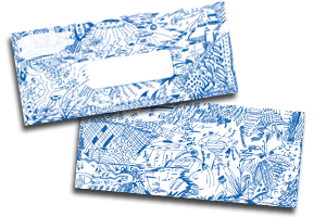
How to avoid: Draw something crazy on the envelope. Make it colorful. Make it look personalized. For my clients, I make it look like I have drawn all over the envelope that they are receiving. It looks like time went into it and that everything was hand-drawn, not printed.

2)    Company XYZ listed as the sender

How to avoid: Use a personalized return label. Write a person who works at the company’s name instead of the company’s name. It will stick out like a sore thumb as a piece of direct mail if the company’s name is listed in the corner. When you use a person’s name, the recipient will be more curious as to who this person is who sent them a piece of mail; with XYZ company, they immediately know why they were sent the mail and simultaneously realize they don’t want to waste their time opening or reading it.

3)    An automated stamp in the upper right hand corner

How to avoid: Pitney-Bowes automated stamps are great for saving time, but they are not great for getting people to open your direct mail. No one feels special when they receive a piece of mail that has been rushed through a machine. Sit down and put real stamps on all of your direct mail – it will work wonders toward making this person feel like you spent time on them and appreciate their future patronage.

4)    Address printed in a black Times New Roman font

How to avoid: It is incredibly important that when you send out direct mail, you print the recipient’s address in a handwriting font. Find a believable handwriting font and use it on all your direct mail envelopes. Have you ever gotten a piece of personal mail that had your address printed in a boring black font on the front? Most likely not. With a handwriting font, it looks like the letter came from a friend.

If you follow these tips I have just provided, your letter will definitely look less like a direct mailer and more like a piece of personal mail. People will be more excited to receive your letter and many times more likely to actually open it. There are more characteristics of direct mail that I haven’t mentioned, but it’s best to avoid as many as you possibly can.


Tuesday, August 11, 2009

Why Handwriting Affects Sales Response Rates

American journalist Lance Morrow once said, “Handwriting is civilization’s causal encephalogram.”

Just as an EEG provides us with a vivid picture of our brainwaves, handwriting is a window into our thoughts and feelings. When you write, your brain controls your hand and all the motor movements you make; inevitably, there will be connections between your mood and the way you write.

Do you write with heavy pressure and a vertical slant? You’re probably the one who can stay cool in rough situations.

Handwriting can not only determine your stress management abilities, but also your probability of success in certain employment fields. When I went on my first post-college job search, I was required to give a handwriting sample to determine her sales potential.  I scored a 100% for a persuasive personality and the company offered to hire me simply on that outcome.

When developing direct mail campaigns, writing sales letters, or working on some other type of marketing campaign, a simple trick is to use a believable handwriting font so people feel connected to the writer. Different styles of handwriting, however, subconsciously communicate different messages to the reader so it is important that the handwriting font has beneficial qualities.

Granted, graphology has been discredited multiple times in America’s history and still receives some hesitation on the part of psychologists nationwide. In fact, only 60 years ago, serious doubts were raised when a simplistic offshoot of graphology called graphoanalysis was popularized. One graphoanalyst was convinced that a glitch in the upstroke of a woman’s ‘H’ meant that she had heart problems. Well, this simply wasn’t true.

Recently, however, highly educated and trained graphologists have turned their focus back to the complexities of handwriting rather than the simplicities. Psychologists from Jung to Freud were deep believers in graphology but rather than looking at letters alone, they looked at the handwriting as a whole. The location of the writing on the page to the size of the letters to the slant of the letters can provide an insight into a person’s inner thoughts and feelings.

So, before you go sending off your next direct mail campaign, make sure you’re completely clear on what you’re communicating to your potential client and ensure that you’re using a sales-proven handwriting font.

The persuasion features of my handwriting are hard to come by, and if you’re trying to win over customers with non-sales handwriting or just plain old Times New Roman fonts, you’re not doing your product justice. For more information on my product Doodleopes™, visit http://www.pdamarketing.net.

Monday, July 27, 2009

Other tips to help you get your direct mail opened - guaranteed!

With direct mail often delivering a 1-3% response rate or even less, it becomes increasingly important to ensure that you’re using a targeted mailing list and have a well-written, attractive letter. Without these things, you’re in for a disappointing campaign and maybe even losses rather than profits.

There are other steps you can take, however, to increase the rate at which your envelopes are opened and read therefore increasing the number of people who will respond. With direct mail, your first impression is the appearance of the envelope. When an envelope looks unusual and is personalized, the recipient is more likely to take a second look. Also, you want to make sure that it stands out – consumers have seen it all before from the pre-approved credit card applications to bland postcards.

From my experience, working with clients from many different industries, there are five tried and true rules that I follow with each campaign.

1)    Use a Live Stamp

Postage meters may be the easiest way to prepare your mail for delivery, but it is not going to get you the best response. Spending a little extra time to actually stamp each and every envelope will make it look like you aren’t mass-producing direct mailers or ‘junk mail’. It will seem as though you drove all the way to the post office to pick up the stamps and then spent a while focusing on each envelope and the impression you were making.

2)    Never use an inkjet printer

Many high volume mailers use high-speed inkjet printers to spit out their direct mail quickly and reliably. But the key problem here is that many high volume mailers use it! People have seen it before and can tell the difference when you use a nice quality printer that may take a little more time.

3)    Personalized Return Address Labels

Again, it may take time or a few extra cents to stick these on each envelope, but the recipient will appreciate it. Taking time for each customer makes it appear as though you are thankful for their business. Also – think about it – how many direct mail pieces you have received lately that had a personalized return address label? Not many. Most have their name printed in the upper left hand corner, a Pitney Bowes stamp in the upper right hand corner, and a little clear hole in the middle where your address is. They couldn’t even take the time to print your address on the envelope! If you are using your business return address, try putting an individual name instead of the business name.  This really makes the piece look more personal.

4)    Use an outrageous, individualized design on the envelope

The days of the plain white envelopes are over as are the days of a little logo in the corner. You have got to go crazy, be outrageously creative, get someone to notice your envelope. Make your envelope the first thing the recipient notices when they open the mailbox. How do you do it? Use a wild color, draw some ‘unplanned’ doodles on the outside, and make it known that you’re not the average company and this is not the average piece of direct mail. Check out the product Doodleopes® for some examples of what I’m talking about.

5)    Use a handwriting font to write the recipient’s address

How many times do I have to say it? Personalize the envelope! Make it look like you spent a lot of time! Find a believable (not fake-looking) hand-written font so it appears as though you handwrote their address on the front of the envelope. This way, your direct mail piece will look like it came from a friend. If you’ve followed the rest of my tips, the recipient will be so curious as to which company spent so much time personalizing the letter for them that they’ll be excited to open it. And if they don’t need the service right now, you’ll have made such an impact that they may just save your direct mail piece on their refrigerator for next time.

Get your direct mail opened... first!

Here's how you can get your direct mail piece opened first. Guaranteed.

When writing copy for direct mail you have to always ask yourself will it get noticed in order to get opened and read. Doodleopes® envelopes will get the direct mail piece opened every single time simply due to its outrageousness and individuality.

  1. When Ralph and Mary get home from work at night and go through their BIG pile of mail that they receive each day in their mail box, they've gotta place this envelope in the 'A-Pile.' This is THE pile you want to be in. It's the pile that gets opened first.

    Which brings me to my next point:

  2. The inside of the envelope is congruent with what is in the outside. This is a BIG mistake that I see people make all of the time. They mail out something that gets opened but nothing ties in the outside with what's inside the envelope. In this case, there are two things that tie everything in together. First of all, the stationary matches the envelope and ALSO the copy ties everything in together. For example, read the PS which explains the 'doodling' and of course the use of a handwritten font is consistent with the whole doodling thing of writing with a pen in hand.

    Only after the piece of mail gets opened can you begin to worry about increasing copyreadership. That's where what I call cosmetic enhancements come into play such asfont, bolding, underlining, subheads, etc. Then, you can head over and use our Doodleopes® copy enhancements to finish the job! 


Head on over and check out Doodleopes envelopes at: http://www.pdamarketing.net/store_envletter.html

Wednesday, July 15, 2009

Putting Doodleopes to Work!

Here's just one example of the amazing things that can be done with Doodleopes! Click on the picture to see it larger and get the full effect.