Monday, July 27, 2009

Other tips to help you get your direct mail opened - guaranteed!

With direct mail often delivering a 1-3% response rate or even less, it becomes increasingly important to ensure that you’re using a targeted mailing list and have a well-written, attractive letter. Without these things, you’re in for a disappointing campaign and maybe even losses rather than profits.

There are other steps you can take, however, to increase the rate at which your envelopes are opened and read therefore increasing the number of people who will respond. With direct mail, your first impression is the appearance of the envelope. When an envelope looks unusual and is personalized, the recipient is more likely to take a second look. Also, you want to make sure that it stands out – consumers have seen it all before from the pre-approved credit card applications to bland postcards.

From my experience, working with clients from many different industries, there are five tried and true rules that I follow with each campaign.

1)    Use a Live Stamp

Postage meters may be the easiest way to prepare your mail for delivery, but it is not going to get you the best response. Spending a little extra time to actually stamp each and every envelope will make it look like you aren’t mass-producing direct mailers or ‘junk mail’. It will seem as though you drove all the way to the post office to pick up the stamps and then spent a while focusing on each envelope and the impression you were making.

2)    Never use an inkjet printer

Many high volume mailers use high-speed inkjet printers to spit out their direct mail quickly and reliably. But the key problem here is that many high volume mailers use it! People have seen it before and can tell the difference when you use a nice quality printer that may take a little more time.

3)    Personalized Return Address Labels

Again, it may take time or a few extra cents to stick these on each envelope, but the recipient will appreciate it. Taking time for each customer makes it appear as though you are thankful for their business. Also – think about it – how many direct mail pieces you have received lately that had a personalized return address label? Not many. Most have their name printed in the upper left hand corner, a Pitney Bowes stamp in the upper right hand corner, and a little clear hole in the middle where your address is. They couldn’t even take the time to print your address on the envelope! If you are using your business return address, try putting an individual name instead of the business name.  This really makes the piece look more personal.

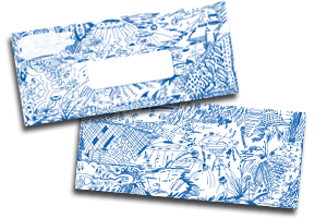
4)    Use an outrageous, individualized design on the envelope

The days of the plain white envelopes are over as are the days of a little logo in the corner. You have got to go crazy, be outrageously creative, get someone to notice your envelope. Make your envelope the first thing the recipient notices when they open the mailbox. How do you do it? Use a wild color, draw some ‘unplanned’ doodles on the outside, and make it known that you’re not the average company and this is not the average piece of direct mail. Check out the product Doodleopes® for some examples of what I’m talking about.

5)    Use a handwriting font to write the recipient’s address

How many times do I have to say it? Personalize the envelope! Make it look like you spent a lot of time! Find a believable (not fake-looking) hand-written font so it appears as though you handwrote their address on the front of the envelope. This way, your direct mail piece will look like it came from a friend. If you’ve followed the rest of my tips, the recipient will be so curious as to which company spent so much time personalizing the letter for them that they’ll be excited to open it. And if they don’t need the service right now, you’ll have made such an impact that they may just save your direct mail piece on their refrigerator for next time.

Get your direct mail opened... first!

Here's how you can get your direct mail piece opened first. Guaranteed.

When writing copy for direct mail you have to always ask yourself will it get noticed in order to get opened and read. Doodleopes® envelopes will get the direct mail piece opened every single time simply due to its outrageousness and individuality.

  1. When Ralph and Mary get home from work at night and go through their BIG pile of mail that they receive each day in their mail box, they've gotta place this envelope in the 'A-Pile.' This is THE pile you want to be in. It's the pile that gets opened first.

    Which brings me to my next point:

  2. The inside of the envelope is congruent with what is in the outside. This is a BIG mistake that I see people make all of the time. They mail out something that gets opened but nothing ties in the outside with what's inside the envelope. In this case, there are two things that tie everything in together. First of all, the stationary matches the envelope and ALSO the copy ties everything in together. For example, read the PS which explains the 'doodling' and of course the use of a handwritten font is consistent with the whole doodling thing of writing with a pen in hand.

    Only after the piece of mail gets opened can you begin to worry about increasing copyreadership. That's where what I call cosmetic enhancements come into play such asfont, bolding, underlining, subheads, etc. Then, you can head over and use our Doodleopes® copy enhancements to finish the job! 


Head on over and check out Doodleopes envelopes at: http://www.pdamarketing.net/store_envletter.html

Wednesday, July 15, 2009

Putting Doodleopes to Work!

Here's just one example of the amazing things that can be done with Doodleopes! Click on the picture to see it larger and get the full effect.

Monday, July 6, 2009

Doodleopes™: Simple Copy Enhancements Lead to Increased Response Rates

Conservative estimates state the average American is bombarded with over 600 advertising messages a day with other estimates as high as 3000. With such an enormous number of messages circulating, it is difficult to get someone to stop and take a second look, even though the information in the message may be highly pertinent. Andrea Ratajczak and the PDA Marketing team have devised a way to get a message to stand out among the hundreds or thousands processed each day: Doodleopes™.

Doodleopes™ are simple hand-drawn doodles and a hand-written font that add a human touch to any marketing message. Doodleopes™ are perfect for use in sales letters and postcards or for non-business use like birthday invitations, blogs, even everyday stationery.

The ingenious idea for Doodleopes™ began with Ratajczak’s first post-college job search. On an application, she was required to give a handwriting sample so that a personality profile could be built to determine her sales potential. As it turns out, she scored a 100% as a perfect match for a persuasive personality. Ratajczak chose not to take that job, but has turned her handwriting and love of doodling into an easy way to boost copy.

Years later Bill Glazer and Dan Kennedy met and hired Andrea’s marketing firm PDA Marketing. With the help of the “Andrea” font, they launched their information-marketing legacy by incorporating the font in their handwritten sales letters. Since then, Andrea’s own individual marketing clients have benefited from using this compelling font in their sales letters, postcards, emails, websites, information products, blogs, and brochures.

Now, Ratajczak has packaged her handwriting font and fun doodles together so that everyone can reap the benefits of Doodleopes™ as copy enhancements. These copy boosters draw attention to the copy just as a speaker uses voice inflection to emphasize certain ideas. Most people today just read past most messages because they are inundated with so many. These tools help keep copy fresh and create little surprises that hold the attention of the reader.

Bill Glazer of Glazer-Kennedy Insider’s Circle testifies to the success that people see in Andrea’s handwriting, “A handwritten font will typically out-perform any other type of font because it appears that it is a friend sending a friend a personal message. The problem is that most handwritten fonts look phony. PDA’s Andrea font is a person’s real handwriting that was created into an easy-to-use tool that I’ve been utilizing for years so the recipient believes that someone is actually writing to them.”

Next to the most obvious eye-catching feature of Doodleopes™, one of the key draws is the ease of use. Unfortunately, most projects must be sent away to costly graphic designers to achieve such results. Upon first use, it is obvious that Doodleopes™ do not take as much time or as much money as marketers are used to spending on direct mail initiatives. To use Doodleopes™, one must only know how to use copy and paste. The doodles are images that will just be inserted into already written copy to draw the recipient’s eyes to the most pertinent information.

For example, if you have an amazing fact in your copy that you want to be sure is noticed, you can add a doodle that says “AMAZING!!”, “INCREDIBLE” or “KAZAM”. If you have an offer that you want to emphasize, you can use a certificate border to make sure the recipient sees the special bonus! Or, even if you just want something to be highlighted, you can add a few colored exclamation points or smiley faces after it. To view already snazzed-up project and other sample doodles, visit www.pdamarketing.net.

If you consider that 44% of direct mail is thrown away unopened, it is hard to imagine what percentage is opened yet thrown straight in the trash. So, there are multiple steps involved in getting the recipient initially interested in your message and then inciting action. To attract as well as hold the consumer’s attention, Doodleopes™ are available on the letter itself to draw attention to the most important points but also on the envelope to convince the recipient to actually open the letter.

Imagine an afternoon when you arrive home from work and walk to the end of the driveway to retrieve your daily mail. You notice that there are two envelopes there: both from companies you have never heard of. One of the letters is in a plain white envelope; the other is in an envelope covered in crazy colored doodles with a seemingly hand-written address label. Obviously, you’ll open the doodled one before the boring envelope (that already puts the envelope in the highly coveted 56%). And, on the inside, you’re offered a gift certificate! Surely that one is not going in the landfill.

Or if you’re a mom who just wants to make the coolest birthday invitations without spending lots of money year after year to buy pre-made ones at the local pharmacy, Doodleopes™ provide you with enough graphics to make hundreds of unique birthday invitations that will make you the talk of the neighborhood.

Ratajczak can guarantee such a high response rate due to past personal experiences. Recently, Doodleopes™ have been featured on local church bulletins to spice up the usual order of worship as well as on direct mail pieces that have had significantly increased response rates. For the users who are not as sure of their design potential, Ratajczak offers her team’s expertise even after the product has been purchased. After a piece has been created, the team will gladly offer suggestions of improvements that could be made to make the piece more effective. To see Andrea give her own take on her product, visit http://www.youtube.com/watch?v=KgSrAsiNgBU

The Mega Doodle package includes a Fast Start guide, the Andrea Font, Certificate Doodles, Accent Doodles, and Done for you Art Files for only $197. Parts are sold separately and are priced from $29. For more information, visit www.pdamarketing.net.